

If you've googled "how to build an affiliate landing page," 90% of the articles boil down to the same thing: grab a ready-made no-code builder, drag blocks around with your mouse, pay $30–100 a month for a subscription. That's a workable path, but it comes at a price — literally and figuratively. You pay for the builder, you're locked into its templates, and you almost always end up with a page that looks "like everyone else's," because it's assembled from the same blocks as thousands of other landing pages on that same service.
Today there's a faster, more flexible path: ask an AI to write the landing page code for your specific task and put it online in a couple of minutes, for free. In this article we'll walk through how to do that in Cursor — a code editor with a built-in AI — what prompt to give the model to get, on the first try, not just a working page but a neatly organized project with a clear file structure and comments in the code, and where to host it once it's ready.
What a Landing Page Is in Affiliate Marketing, and Why You Need One
A landing page is a standalone page built around a specific offer, where a user lands after clicking your ad or affiliate link. It has one job: to move the person toward a target action — filling out a form, leaving an email, signing up, subscribing, or making a purchase. Unlike a full website, a landing page has no navigation menu, no outbound links, and no distracting elements — every path on the page leads to a single button.
Why bother with a separate page at all instead of just sending traffic straight to the advertiser's site:
- Control over the first impression. You decide what the user sees in the first three seconds, not the advertiser.
- A/B testing. You can quickly change the headline, the offer, the button color, and see what actually drives more conversions.
- Warming up before the offer. An intermediate page "warms up" the user and lowers the cost per lead.
- Traffic isolation. A separate domain and page means clean statistics, without unrelated traffic from a main site mixing in.
- Speed. A simple one-page structure loads faster than a bloated builder-made site, and load speed directly affects conversion rate.
Learn more about how AI is changing media buying and helping optimize traffic management in our article about AI in media buying. For more practical solutions and tools, explore our AI Tools section.

Why Code Instead of a Page Builder
Most no-code landing page builders share three structural limitations:
- The subscription eats into your margin. Early on, when you're testing 5–10 offers in parallel, $50–100 a month for a single tool is a noticeable expense — especially if some of those tests don't pay off.
- Templated look. Even with customization, a page built on a builder is visually recognizable to ad-network moderation algorithms and to users alike — it "smells" like a template.
- Extra weight. Builders generate heavy HTML/CSS/JS loaded with dozens of the service's own analytics scripts — that hurts load speed on mobile traffic, and mobile traffic is often the majority in affiliate marketing.
With tools like Cursor — a code editor with a built-in AI — writing the landing page code yourself has become no harder than assembling one in a builder, except the result is lighter, faster, and entirely yours. And you don't need to be a developer: you describe what you want in words, and the model writes the code.
Cursor: A Code Editor with Built-in AI
Cursor is a VS Code-based code editor with a built-in AI assistant that sees your entire project and can write, edit, and explain code based on your instructions in a chat (Cmd/Ctrl+K for a targeted edit of a selected snippet, Cmd/Ctrl+L for a chat about the whole project). It downloads and installs like a regular app. Cursor has a free Hobby tier — it's meant more for trying the tool out than for daily driving it: agent request limits are restricted, and that's usually enough for one simple landing page, but if you use the agent heavily during a session (especially sending a lot of follow-up prompts in a row), you can burn through the limit sooner than expected — at that point you'd either wait for it to reset or upgrade to a paid plan starting at $20/month.
The main advantage for a landing page: instead of one messy file, you immediately get a properly organized project — with styles, scripts, and images split into folders — which is then easy to edit, extend, and hand off to anyone.
Step 1. Create an Empty Project
Open Cursor, create an empty folder called landing-project, and open it in the editor (File → Open Folder). The AI will build the entire file structure inside it based on your prompt — you don't need to create anything by hand.
Step 2. Give the Model a Complete Brief
Prompts are better written in English — the model follows the structure more precisely and loses fewer details of the brief than it does in other languages. In the Cursor chat, in the bottom-left corner, make sure Agent mode is selected (not the regular chat mode) — that's what gives the model permission to create and edit multiple files in the project on its own, instead of just pasting code as text for you to copy manually.
A good landing page prompt isn't a couple of lines — it's a full brief: the tech stack, the theme and brand, a task to research current trends before styling, the page structure by section, a requirement for code comments, and even how the application form should behave. This time, it's better not to dictate the project's file structure rigidly and instead trust Cursor to handle it — it knows how to lay out a static site into folders following best practices. Here's what a prompt like that looks like inside the Cursor chat:
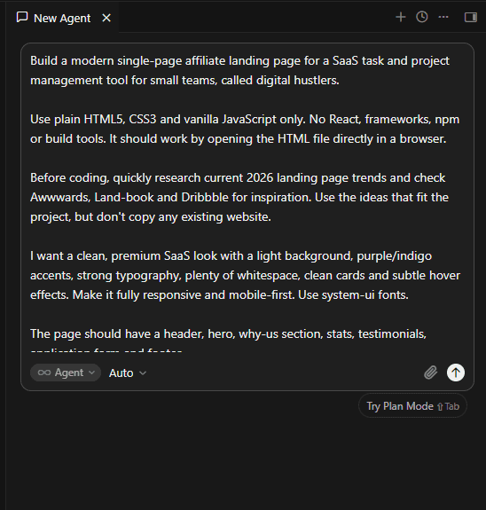
Full text of the prompt (Cmd/Ctrl+L):
Build a modern single-page affiliate landing page for a SaaS task and
project management tool for small teams, called digital hustlers.

Use plain HTML5, CSS3 and vanilla JavaScript only. No React, frameworks,
npm or build tools. It should work by opening the HTML file directly in
a browser.

Before coding, quickly research current 2026 landing page trends and
check Awwwards, Land-book and Dribbble for inspiration. Use the ideas
that fit the project, but don't copy any existing website.

I want a clean, premium SaaS look with a light background, purple/indigo
accents, strong typography, plenty of whitespace, clean cards and subtle
hover effects. Make it fully responsive and mobile-first. Use system-ui
fonts.

The page should have a header, hero, why-us section, stats, testimonials,
application form and footer.

Hero headline:
"Earn from subscriptions that actually renew"

Mention up to 30% recurring commission and use "Apply Now" as the main CTA.
The three benefits should be recurring commissions, ready-made
creatives/banners and a real-time partner dashboard.
Add four stats, three testimonials and an application form with name,
email and website/channel.

Connect the application form to Web3Forms. Use vanilla JavaScript to
submit the form without leaving the page, show a success or error
message, and leave a clear placeholder for the Web3Forms access key.

All CTA buttons should smoothly scroll to the form.

Keep everything responsive and accessible. Use semantic HTML and add
short comments to the main HTML sections, CSS blocks and JavaScript
functions.

Choose the project/file structure yourself based on best practices for
a small static website. Also create a short README explaining how to
open the project and where to configure Web3Forms, analytics and
affiliate tracking later.

Don't overengineer it. I want it to look like a real modern SaaS
affiliate landing page, not a generic AI template.
Let's break down what matters here and why this isn't just a wish list:
- "Before coding, quickly research current 2026 landing page trends..." — instead of manually listing trendy techniques (which go stale fast), the prompt asks the model itself to first look at what's currently trending on reference sites, and only then write the styles based on that. For this to actually work, Cursor needs internet access / web search enabled in agent mode (not available in every setup or plan) — if the model can't reach the web, it will describe patterns based on its training data instead, which is still fine, but doesn't guarantee the very latest trends.
- "Connect the application form to Web3Forms..." — this is the simplest way to get a working application form without your own backend and without setting up a separate server: Web3Forms accepts a POST request straight from the front end and emails you the submitted data. Just sign up for free, get an access key, and drop it into the placeholder Cursor leaves in the code — no server-side code required.
- "Choose the project/file structure yourself based on best practices" — for a single-page static site, Cursor will suggest a sensible structure on its own (usually something like
index.html,README.md, and anassets/folder with subfolders for css/js/images) — you don't need to dictate it manually for a simple task like this. - Comments in HTML, CSS, and JS — even if you don't know how to code, you'll be able to open the stylesheet or script file and, from the comments, understand what each block does, so you can tweak something yourself later or hand it off to a freelancer.
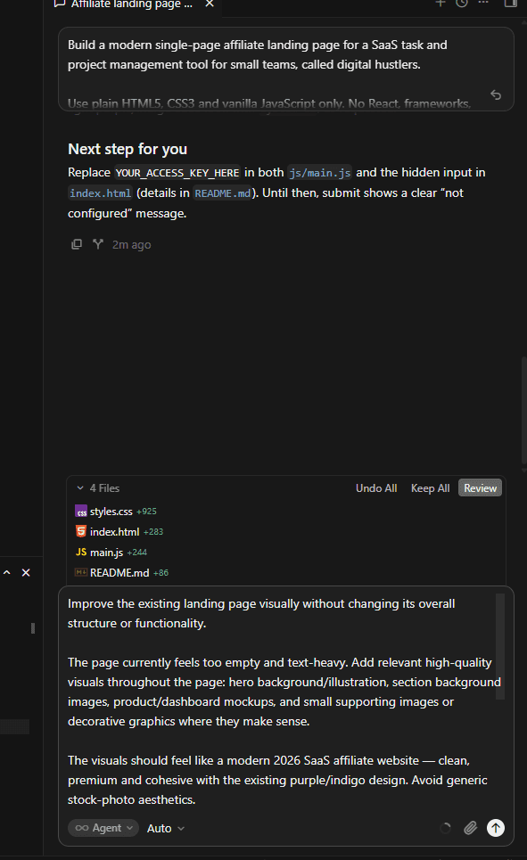
After the first prompt, you'll have a working but somewhat "empty" page — Cursor is good at assembling structure and logic, but less likely to add visual polish on its own. That's normal: instead of trying to get a perfect result from one giant prompt, send a follow-up refinement prompt as a second message in the same chat:
Improve the existing landing page visually without changing its overall
structure or functionality.

The page currently feels too empty and text-heavy. Add relevant
high-quality visuals throughout the page: hero background/illustration,
section background images, product/dashboard mockups, and small
supporting images or decorative graphics where they make sense.

The visuals should feel like a modern 2026 SaaS affiliate website —
clean, premium and cohesive with the existing purple/indigo design.
Avoid generic stock-photo aesthetics.

Use images intentionally to create visual hierarchy and make the
sections feel more alive. Add subtle gradients, abstract shapes,
screenshots/mockups and background visuals where appropriate.

Make sure all images are responsive, optimized, and don't hurt
performance. Use local assets where possible and keep the existing
HTML/CSS/JS architecture.

Don't redesign the whole page. Keep the current content and
functionality, but make the landing page significantly more visual
and polished.
This is a good illustration of how you should generally work with Cursor: instead of trying to fit everything into one perfect prompt, work iteratively — first structure and logic, then a separate prompt to refine a specific aspect (in this case, visuals), without risking breaking what's already working.
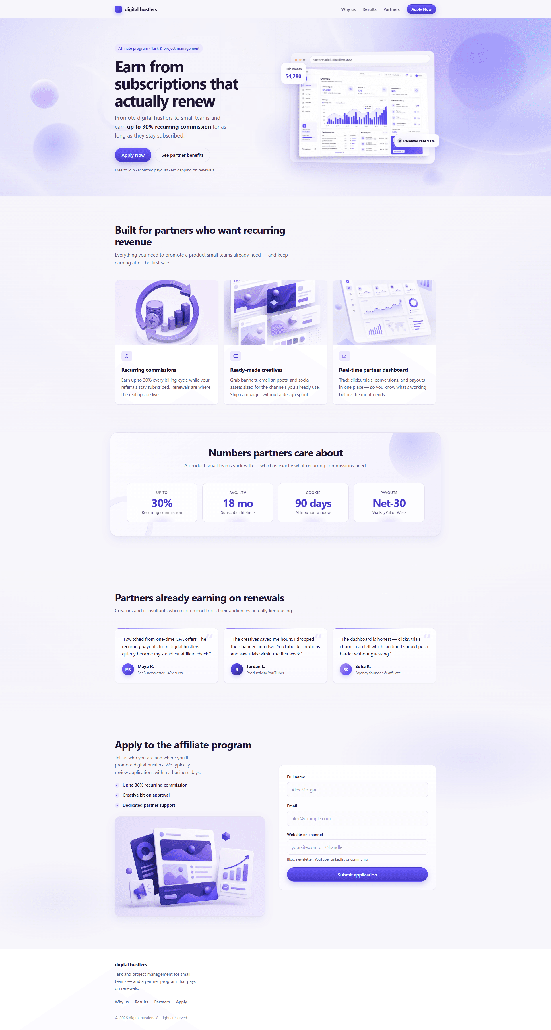
The result of this exact two-prompt combo — a working page assembled without a single manual code edit. It already has everything from the brief: a header with a logo and an Apply Now button, a hero with the headline "Earn from subscriptions that actually renew" and a partner dashboard mockup, three benefit cards, a stats block (up to 30% commission, subscriber LTV, attribution window, payout frequency), three testimonials, and a three-field application form. This result shows exactly what you can achieve with just two messages in a Cursor chat — from structure and form logic to visual polish with illustrations and interface mockups.
Step 3. Review the Result and Refine Precisely
Once Cursor has created all the files, open index.html through the built-in Live Preview or a local server (npx serve in Cursor's terminal) and check the result in your browser.
From here, edits are either new messages in the same chat ("add a countdown timer instead of the stats counters," "make the accent color green"), or a targeted edit: select a specific chunk of code in a file and press Cmd/Ctrl+K with an instruction that applies only to that fragment — this is faster than rewriting the whole file, and the AI won't touch anything else.
Step 4. Plug in Real Content and Tracking
After generation, Cursor usually tells you what's left to do — for example, it sends a short message in the chat like "Next step for you: replace YOUR_ACCESS_KEY_HERE in js/main.js and the hidden input in index.html (details in README.md). Until then, submit shows a clear 'not configured' message":
Show Image
That's exactly the placeholder for Web3Forms: sign up, get your access key, and drop it into both spots mentioned — the application form will start working right away and send submissions straight to your inbox, no server needed.
Next, replace the text placeholders with real offer copy, or with a different niche or brand if needed. Replace the link on the CTA buttons with your tracking link from the affiliate network (with a sub_id parameter, so you can see the traffic source in your stats). In a separate message, ask Cursor to add whatever analytics script or conversion pixel you need, for example: "add a Facebook Pixel / [network] conversion event to main.js on form submit, I'll paste in the pixel ID myself."
One Landing Page, Many Offers: Why Only the Copy Changes
In affiliate marketing, you rarely bet on a single offer. Usually you test several at once — different geos, different networks, different value propositions — and put a small budget behind each one to see which pays off faster. There's a technique a lot of people use but rarely explain out loud: instead of building a brand-new landing page from scratch for every offer, you reuse the same proven-structure landing page and just swap out the text, colors, and images.
Why this works better than rebuilding the page every time:
- A structure that already converts stays untouched. Block order, form length, CTA placement — these are exactly the things that take the longest to fine-tune and test. If one landing page already shows a good conversion rate, there's no point risking it and reinventing the composition for every new offer.
- Faster test launches. Swapping the headline, bullet points, and accent color takes 10–15 minutes, not a whole new build cycle. The faster you can launch a test for a new offer, the faster you can kill it or scale it.
- Fewer performance and responsiveness surprises. The code has already been checked on mobile and already been through revisions in Cursor — you're not dragging potentially rough markup into a new offer.
- Easier to track statistics by pattern, not just by offer. If several offers on the same structure show different conversion rates, it's easier to tell what actually made the difference — the offer or niche itself, rather than random differences in the layout between separate pages.
How to do this in Cursor, technically — don't copy the project by hand, just ask the model directly in a separate prompt on top of the already-finished landing page:
I want to reuse this landing page for a different affiliate offer without
changing its structure, layout, or functionality.

New offer: [describe the niche and offer — e.g. an affiliate program for an
online fitness coaching app].

Replace all the copy (headline, subheadline, benefits, stats, testimonials,
CTA text, form labels) to fit the new offer. Update the accent color to
[new color], but keep the same layout, spacing, components and
JavaScript logic.

Don't change the file structure or the Web3Forms integration — just update
the access key placeholder and copy where needed.
From one working landing page, a single prompt like this produces a new one for a different offer — with the same proven structure, but entirely different content and branding.
Learn more about how affiliate marketing works, its business models, verticals, and current approaches to promotion in our affiliate marketing guide.
What Absolutely Needs to Be in the Prompt for a Converting Page
Regardless of which specific offer you're describing, include these points in your prompt — they cover the baseline requirements for a converting landing page:
- One clear CTA, repeated 2–3 times across the page (in the header, after the hero block, at the end), with concrete action text ("Become a Partner," "Get the Bonus") rather than "Click Here."
- A headline and subheadline that immediately explain the benefit, rather than just describing the product.
- A short form — no more than 3–4 fields. Every extra field in a form lowers conversion.
- Social proof — testimonials, numbers, partner/payment-provider logos.
- Mobile adaptation as a priority, not something to fix "later" — ask for mobile-first layout from the start.
- Above the fold — the headline, the offer, and the button should all be visible without scrolling.
- Speed — ask the model not to add extra fonts, icon libraries, or animation frameworks unless they're critical to conversion.
Deploying the Landing Page: Vercel
Writing the code is only half the job — the page needs somewhere to live. The easiest option is Vercel, and for a finished folder of static files, it's done without a single terminal command:
- Sign up at vercel.com (via email or a GitHub account works).
- In the projects dashboard, click "Add New → Project."
- Drag the
landing-projectfolder straight into the browser window (drag-and-drop) — Vercel will automatically detect it's a static site and publish it. - You get a working address like
your-project.vercel.appwithin seconds. A custom domain can be connected in the project settings — you just need to add a couple of DNS records with your domain registrar.
Vercel's free tier is more than enough for a single-page landing page.
Next Steps After Deployment
Once the landing page is deployed, the standard optimization cycle follows — and part of it can be handed off to AI as well:
- Add analytics. Ask Cursor to insert Google Analytics/GA4 or the pixel for whichever ad network you're using — literally one message in the chat.
- Set up sub_id/click_id in your CTA links, so you can see which traffic source is driving which conversions.
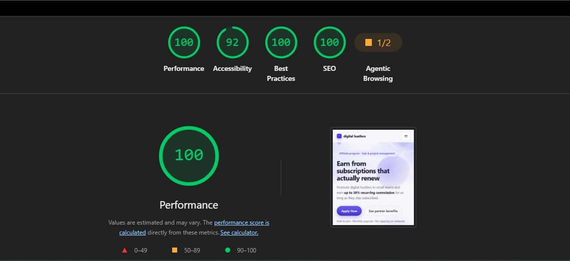
- Check the speed with PageSpeed Insights — if something's slowing it down, ask the AI to optimize that specific bottleneck (for example, compressing or lazy-loading images).
- Put together 2–3 versions of the headline/CTA and run an A/B test — generating alternative copy variants in the same chat takes a couple of minutes.
Bottom Line
Landing page builders solve the problem of "fast, but expensive and templated." Cursor solves it differently: you give the model a detailed brief in words and work iteratively — first the structure, logic, and a working application form via Web3Forms, then a separate prompt to strengthen the visuals — and you end up with a clean, clearly organized project that deploys to Vercel for free in a matter of minutes, with no monthly subscription and no template limitations. The more detailed and structured your prompt going in, the fewer revisions you'll need coming out.
